
 How many logos have you seen today? Perhaps you maintain a lofty disdain for such things, but logos are unavoidable and, in their own way, quite remarkable. With a few lines, a good logo can articulate the aims of a charity or symbolise a city.
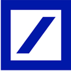
Deutsche Bank. Designer: Anton Stankowski, 1974 Logos today get a pretty bad press: "How much? My 12-year-old could have done that." Often, that's true, sort of. Take the Deutsche Bank logo. Created in 1974 by artist and designer Anton Stankowski, it consists of a blue box with an oblique line inside: that's it. And yet it represents a multibillion-pound business. Any self-respecting pre-teen with a ruler and a felt tip could have made a decent stab at it, a fact not lost on German newspaper Bild Zeitung which, at the time of the logo's launch, wrote a disbelieving story headlined "Artist gets 100,000 Marks for five lines" (he didn't get that much, by the way).
And yet such graphic devices can attain enormous power. So what makes a successful one? Simplicity helps. The Deutsche Bank square is neat visual shorthand for the type of values you might want in a bank security (the square) and growth (the oblique line) – hopefully of your savings and not just the employees' bonuses. But its real power comes from repetition. A line in a box could represent any bank, but repeat it often enough (with a few million in marketing spend behind it) and it comes to be associated with just one.
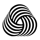 Woolmark. Officially designed by Francesco Saroglia but often credited to Franco Grignani, 1964 A bit of visual trickery works too. Take the Woolmark, the Op Art-inspired skein devised for the International Wool Secretariat in 1964. It's a beautiful, timeless symbol abstracted just enough. Or, also from 1964, the British Rail logo, known variously as "the crows' feet", "the barbed wire" or "the arrows of indecision". It replaced the old "ferret and dartboard" crest that had been in use since 1956, sweeping away pseudo-heraldic flummery with a bold modernism that promised a new "Age of the Train".
Logos can also be friendly, lovable even. Bibendum, aka the Michelin Man, first appeared in 1898. Legend has it that the Michelin brothers, Edward and André, were visiting the Lyon Universal Exhibition in 1894 when Edward noticed a pile of tyres on the company stand and declared "with arms, it would make a man". Compared with the grinning character that we are accustomed to, early versions depict an almost sinister figure, bespectacled and chomping permanently on a cigar. For a while, he was even known as the "road drunkard".
 Michelin. Designer: O’Galop (Marius Rossillon), 1898 Few logos today match the charm of a Bibendum or the simplicity of a Woolmark. Overcomplicated and overdesigned, they are the victims of endless research and managerial dithering, setting costs spiralling. But to take the ethos of an organisation and successfully boil it down into a simple mark takes rare skill. Think of the WWF Panda, the London Underground roundel or the Rolling Stones tongue. Logos carry the can for capitalism's excesses but can also be adored elements of our visual culture.
All those mentioned above feature in Creative Review's 20 favourite logos chosen for our current issue. What would be on your list?
Article By: Patrick Burgoyne
guardian.co.uk,


No comments:
Post a Comment